Master of atmosphere
Andrew Lambirth
Vuillard: From Post-Impressionist to Modern Master Royal Academy, until 18 April
There has never been a major exhibition devoted to the work of Edouard Vuillard (1868-1940) in Britain. In recent years I've seen small commercial shows, but these have not been able to marshal the range of important paintings needed to do an artist justice. Now the Royal Academy plays host to a reduced version of the massive retrospective which started out in Washington DC, and was but lately in Paris. It is an intriguing collection of fewer than 200 paintings and drawings, supplemented by some 80 of Vuillard's own photographs. It makes a strong argument for Vuillard as an artist of singular talents, who declined into vulgarity, and shows him to be not a patch on his friend Bonnard, who just got better. But what a contrast to have at the RA — Vuillard side-by-side with Guston, and upstairs the Flemish manuscripts still on view. Riches and choice indeed.
Vuillard's work proposes an alternative strand of Modernism to that traced through Fauvism, Cubism and Surrealism, taking its impetus from the use of colour and symbolism pioneered by Gauguin. A founder-member of the avant-garde group of artists known as the Nabis (or prophets), with whom he began to exhibit in 1891, Vuillard chose to depart from naturalism by flattening and simplifying his forms and intensifying his colours. The claustrophobic interiors he painted symbolised the emotions of the protagonists who peopled them. Vuillard was supremely good at painting atmospheres thick enough and tense enough to be cut with a knife. He was a master of psychological penetration of the domestic hearth, and he was blessed (if that is the word) with a family sufficiently complicated to provide him with choice subject matter. The results are paintings of a curious richness and intimacy.
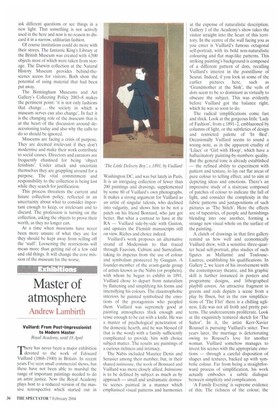
The Nabis included Maurice Denis and Serusier among their number, but, in their shared ituimisme, the work of Bonnard and Vuillard was more closely allied. Intimisme is to be defined by subject as much as by approach — small and undramatic domestic scenes painted in a manner which emphasised visual patterns and harmonies at the expense of naturalistic description. Gallery 1 of the Academy's show takes the visitor straight into the heart of this territory. In the centre of the wall facing you as you enter is Vuillard's famous octagonal self-portrait, with its bold non-naturalistic colouring and flat map-like patterns. This striking painting's background is composed of a different pattern of dots, recalling Vuillard's interest in the pointillisme of Seurat. Indeed, if you look at some of the earlier pictures here, such as 'Grandmother at the Sink', the veils of dots seem to be so dominant as virtually to obscure the subject. This was evidently before Vuillard got the balance right, which he was so soon to do.
The radical simplifications come fast and thick. Look at the gorgeous little 'Lady of Fashion', from c.1891-2, emblazoned by columns of light, or the subtleties of design and restricted palette of 'In Bed'. Occasionally Vuillard seems to sound a wrong note, as in the apparent crudity of 'Lilacs' or 'Girl with Hoop', which have a hallucinatory painting-by-numbers quality. But the general tone is already established — the refined ability to experiment with pattern and texture, to lay out flat areas of pure colour to telling effect, and to aim at depicting ideas and emotions. There's an impressive study of a staircase composed of patches of colour to indicate the fall of light, and consider the complexity in the fabric patterns and juxtapositions of such pictures as 'The Stitch'. Here the effects are of tapestries, of people and furnishings blending into one another, forming a strange new visual whole on the surface of the painting.
A clutch of drawings in that first gallery remind us how well and economically Vuillard drew, with a sensitive three-quarter head self-portrait, plus studies of such figures as Mallarme and ToulouseLautrec, establishing his qualifications. In Gallery 2, we learn of his involvement with the contemporary theatre, and his graphic skill is further instanced in posters and programme designs, and lithographed playbill covers. An attractive fragment in greens and reds depicts a scene from a play by Ibsen, but in the raw simplifications of 'The Flirt' there is a chilling ugliness. Life was not all froth and pretty patterns. The undercurrents proliferate. Look at the exquisitely textured sketch for 'The Suitor'. In it, the artist Kerr-Xavier Roussel is pursuing Vuillard's sister. Two years later, the marriage is deteriorating owing to Roussel's love for another woman. Vuillard somehow manages to invest his scenes with the appropriate emotions — through a careful disposition of shapes and textures, backed up with symbolic colour. Far from being a straightforward process of simplification, his work actually embodies a subtle dialogue between simplicity and complication.
'A Family Evening' is supreme evidence of this. The richness of the colour, the embroidered density of pattern in this disquietingly dark interior, all make it a marvel of pictorial design and paintwork, but difficult to look at. A family crisis has arisen, and this is what Vuillard has so brilliantly captured. But it's by no means all doom and gloom, for Vuillard was such a marvellous painter — dabbing and speckling away like mad at this period. The colours leap out at us, like the shocking hues of a scene from a theatrical adaptation of the Song of Songs, an almost-cacophony of red, green, orange, pinks and mauves.
It's a curiously diffuse and discursive exhibition, winding in and out, through a plethora of intimate encounters to the more public statements. Gradually the subjects begin to change. The countryside has been introduced in The Guinguette' (c.1898), a beautifully modulated set of variations in blue and green as Vuillard magically evokes trees and sky. There's potential here, obviously. But Vuillard instead gets sidetracked by his decorative schemes. These are generally on a large scale (apart from some deliciously delicate plates he designed as part of a table service for a friend), and pursue the policy of simplification to good effect. Five of the original nine panels of The Public Gardens' have been brought together in Gallery 3, and look tremendous, with their preliminary studies and two rather fine overdoors. There's also a design in distemper on linen, originally done for a screen, which has the most extraordinary texture to enhance its airy linearities, and looks utterly ravishing. This is the kind of thing Vuillard was very good at.
What he was not good at is portraits. This comes rather as a surprise. For someone so adept at conveying atmosphere as Vuillard, how could his later commissioned portraits be so dull? Perhaps because around 1900 he turned back towards naturalism, and moved away from the unique pattern-making at which he excelled. (The amazingly daring design of 'The Striped Blouse' of 1895, for example.) He could have taken a different path into landscape painting — a couple of freely brushed compositions in distemper on paper in Gallery 4 attest to his skill, as does the extraordinary thundery light in 'Boating' of 1897 — but sadly didn't. Instead we have the curiously sapless and disappointing portraits in Gallery 5, ranging from the lurid to the insipid. Of course there are occasional passages of fine painting still to be seen (the five-part screen from 1911 with its high view of the Place Clichy has a memorable fluidity and dash), but the coherence and grip have gone. And that is a tragedy, for design was Vuillard's greatest skill. Nor does the colour compensate, for Vuillard is not half the colourist that Bonnard is.
So the show ends badly, but there are so many really good things here that the aging painter should perhaps be forgiven for selling out.


 Previous page