Style of contradictions
Andrew Lambirth on the V&A's vast and magnificent exhibition of Art Deco
Ai.rt Deco is the style that succeeded Art Nouveau, enjoyng a surprisingly long global Ai stretching from 1910 to 939, and from Europe to America, India and Australia. As the curators of this vast exhibition (over 300 exhibits) maintain, Art Deco was 'arguably' the most popular style of the 20th century, affecting everything from skyscrapers, night-clubs, cocktail bars and cinemas, to handbags, shoes and letterboxes. It was a style of contradictions, an inter-war hold-all which was modern without being Modernist (though the two fruitfully overlapped, as in the Modernist icon, Lubetkin's Highpoint One building in Highgate), frivolous in some manifestations, austere in others, hand-crafted yet industrially moulded and mass-produced, universal yet individual.
This pluralism makes Art Deco an ideal style to celebrate in our 'anything goes' society. Its imagery employed frozen fountains, petrified sunbursts and dynamic zigzags to great effect, and derived its inspiration from Art Nouveau, Cubism, the Russian ballet (particularly a fondness for bright colours: jade green, purple, scarlet and orange), American Indian and African art and the Bauhaus. It attempted to close the gap between art and industry, focused on the city and the machine through leisure and entertainment, and unashamedly tried to give people what they wanted — a bit of glamour. Never before was an art movement so openly dedicated to consumerism.
The V&A's stunning exhibition has been three years in the making, and is divided into five sections: Style and the Age, Sources, 1925 Paris Exhibition, Spread of Art Deco and Deco World. It opens with a taste of high style and chic — Franz Hagenauer's brass mirror surround in the shape of a girl's head and hand, JacquesEmile Ruhlmann's gorgeous Lotus dressing-table, all neo-classical elegance in ebony and ivory inlay. an exquisite lacquer jewellery box by Yamazaki Kakutaro, and that apogee of streamlined engineering, a Waterwitch outboard motor. This display eloquently indicates the range of objects to be found in the show at large, backed up as it is by paintings, posters and sculpture, carpets and fabrics, dresses, photographs and ceramics. Some of the finest exhibits are pieces of furniture. At one extreme is Ruhlmann, at another is Eileen Gray's austere silver-leaf day-bed like a dugout canoe: marvellously elegant but no doubt hideously uncomfortable. Somewhere in the middle is the extraordinary stomachy chiffonier by Andre Groult, all sharkskin marquetry and anthropomorphic curves. With such an embarrass de richesse to choose from, the visitor needs a little expert guidance. At this point it is customary to turn to the catalogue.
There is no catalogue as such for this exhibition. There is a massive publication of 40 chapters and over 400 pages, containing scholarly contributions from 29 different authors. In hardback it costs £40 and is an unwieldy coffee-table book; it is cer
tainly not the modest and informative publication you would wish to carry round the exhibition and consult. And it seems that, for the show's curators, the book is a more important event than the visual revelation we experience as we walk round the V&A's galleries.
In the introduction there is mention made of 'this book and its related exhibition'. Is this the way visual arts programming is going? How can the experience of seeing the work of art be secondary to an expert's interpretation of it? And yet the most likely souvenir (besides postcards) that the enthusiastic and solvent visitor will take away from the exhibition will be this mammoth tome. Still, there was a 12-volume encyclopedia published to coincide with the 1925 Paris exhibition which constituted the high point of Art Deco. At least we don't have to cart that about. Much more useful than the V&A's publication, and capable of being slipped into a pocket, is Bevis Hillier's pioneering 1968 Studio Vista book on the subject, if you can find a copy.
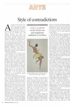
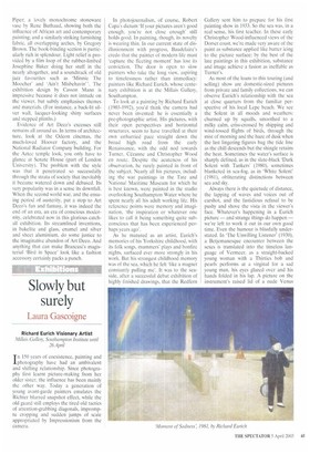
One of the highlights of the show is the reconstructed foyer from the Strand Palace hotel, which was saved by the V&A from the possibility of being dumped at sea in 1969. Its designer was Oliver Bernard, who'd originally worked as a theatre designer and was also responsible for designing the Lyons Corner Houses. The Strand Palace foyer is a glamorous confection of internally lit glass architecture, mysterious, prismatic and luxurious, and it's quite beyond me why anyone could have wanted to destroy it. A highlight for car lovers is the Auburn 851 Boat Tail' Speedster by Gordon Miller Buehrig, dating from 1935, a beautiful object even for the non-driver.
Of course, the exhibition is full of beautiful objects — except when they're not. Look, for instance, at the repulsive engraved glass vase by Tchelitchew, the bulging adiposity of Tamara de Lempika's 'La Belle Rafaeta', or the ever-so-jaunty vulgarity of Clarice Cliff.
Among the countless gems I must mention a few favourites: Josef Gocar's cubist cabinet, angular and massy, containing a Cuthbert Hamilton Vorticist plate and a Leger-like Malevich cup and teapot; the fabulous dynamic poster for the Daily Herald by McKnight Kauffer; carpets by Betty Joel, Gustave Miklos and Jaap Gidding, whose rug looks like a John Piper; a lovely monochrome stoneware vase by Rene Buthaud, showing both the influence of African art and contemporary painting; and a similarly striking furnishing fabric, all overlapping arches, by Gregory Brown. The book-binding section is particularly rich in splendour. Light relief is provided by a film loop of the rubber-limbed Josephine Baker doing her stuff in the nearly altogether, and a soundtrack of old jazz favourites such as 'Minnie The Moocher' and 'Ain't Misbehavin", The exhibition design by Casson Mann is impressive because it does not intrude on the viewer, but subtly emphasises themes and materials. (For instance, a back-lit silver wall, lacquer-looking shiny surfaces and stepped plinths.) Evidence of Art Deco's excesses still remains all around us. In terms of architecture, look at the Odeon cinemas, the much-loved Hoover factory, and the National Radiator Company building. For the Aztec temple look, you only have to glance at Senate House (part of London University). The problem with the style was that it penetrated so successfully through the strata of society that inevitably it became watered down and debased. Its very popularity was in a sense its downfall. When the second world war, and the ensuing period of austerity, put a stop to Art Deco's fun and fantasy, it was indeed the end of an era, an era of conscious modernity, celebrated now in this glorious catchall exhibition. Its streamlined inventions, in bakelite and glass, enamel and silver and sheet aluminium, do some justice to the imaginative abandon of Art Deco. And anything that can make Brancusi's magisterial 'Bird in Space' look like a fashion accessory certainly packs a punch.
I


 Previous page