Change It will not have escaped our readers' notice (very
little does) that the front cover of this week's
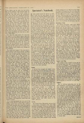
Spectator is different from its predecessors. There haVe been a number of such changes in the paper's long life, but we are particularly pleased with this one, believing it to be an indisputable gain in typographical elegance and vigour. Our readers, we hope, will agree. A paper which has flourished as long as the Spectator (established 1828) has only done so through a continuing pro- cess of self-rejuvenation. It is our duty (and privilege, if I may use the word this week) to be modern while at the same time remaining attached to unchanging principles. As it happens, the type-face in which the word Spectator now appears on our cover is known as 'Modern.' It was not chosen for that reason, but we like the name, nevertheless. Other modest changes in the appearance of the paper may be expected in time. We don't forget, of course, that it is what is written in these pages, not their typo- graphical details, that really matters to the reader: and to us.


 Previous page