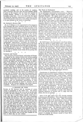
A CHANGE OF TYPE READERS of The Spectator will be
conscious of certain changes in typography in this week's issue. The antique lettering of the title, both on the cover and on the first page of matter, has been changed, as in the case of The Times a few years ago, to square Roman capitals, which have a bolder effect and make the paper more easily recognisable on bookstalls and elsewhere ; what was appropriate in 1828 when The Spectator started is not necessarily ideal in 1937. The change in type throughout the body of the paper has been made after prolonged and careful experiment, with a view to greater clarity in detail and the general improve- ment of the appearance of the page. Habit goes far to deter- mine taste, but though there may be some regular readers who will for a time feel a touch of the unfamiliar about The Spectator, the general opinion will, we believe, be that the paper is more attractive in its latest guise and that contents readable in the literary sense are the more readable for the form in which they are now clothed.


 Previous page