ARTS
Exhibitions
The Turner Collection in the Clore Gallery
The Stirling devaluation
Giles Auty
he opening of a major new art gallery is a rare event. On the afternoon of 1 April the new Clore Gallery, built at Millbank to house the Turner Collection, was opened officially by Her Majesty the Queen. Heavy rain did not deter a noisy demon- stration by a body which felt Turner had been treated less than justly both in the naming of the gallery and in the pictorial displays, but the deluge did manage to wash out the evening's outdoor musical celebrations. Necessary pomp was added, nevertheless, by an impressive display of fireworks which took place, later on, above the Thames. But in the months before the Official opening there had already been Pyrotechnics aplenty caused by an interac- tion between the consultant architects, James Stirling, Michael Wilford & Associ- ates and the gallery's own curatorial staff. Much, but by no means all of the controversy, centred around the colour, or lack of it, of the walls of the main galleries. It is known Turner favoured a deep red as a permanent backdrop to his masterpieces. The precise shade of this colour may have been open to debate but was certainly nowhere near the neutral oatmeal insisted On by the architects. Thereafter it seems the hue most favoured by the consultancy's 9Pponents became nothing less than architect's blood.
Clearly the issue is, and promises to remain, divisive. To label it simply as Reds V the Rest makes it sound like a re- enactment of the critical climate which Prevailed in British art during the early Seventies. Then, as now, the Red faction seemed to be in overwhelming majority as Young, ex-Cambridge, would-be commis- sars belaboured the capitalist art market With their turgid prose. Today, however, our new 'Reds' are conservatives, anxious to implement at least some of the post- humous instructions of Britain's greatest artistic genius. Without wishing to sound, let alone be, a dithering liberal, it strikes me that for once there are arguments worthy of respect on either side. For the 'Reds' there are the known wishes of Turner, not only as outlined in his will and its codicil but as put into practice in the artist's own art gallery. On the other hand, painters are not always the best judges when it comes to presenting their work, as many a gallery owner or curator will tell you. Turner had never seen the cool, neutral spaces of a modern art gallery and based his ideal on the badly-lit, early Victorian rooms which he knew. There is certainly a strong historic case for red, especially where works are hung Closely, limiting the amount of background Which can be seen. However, where the View up the stairs in the entrance hall paintings are spaced more widely, in a single line, the amount of visible backdrop increases considerably and can account for up to two thirds of the total hanging area. If this area were to be a solid red, what would be the visual effect on the gallery interiors, as a whole?
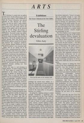
In opting for a lighting scheme to which daylight contributes a significant part, those responsible for the Clore Gallery's design have strengthened the case for light-coloured, reflective walls. For a pain- ter such as Turner of subtle, atmospheric works, natural, variable lighting is ideal. Thanks to such lighting, paintings no lon- ger need be static entities, frozen forever by artificial lighting, but become living and changing presences. In the end, it says much for the strength of Turner's art that it would look marvellous against almost any background. It is the feeble evanescence of many recent artistic artefacts which some- times makes strictly-controlled, rigid light- ing systems imperative. Turner's oil paint- ings are powerful enough to cope with changeable lighting, within a modern gal- lery interior. In a sense the latter may even help us increase our appreciation of the timelessness of his artistic genius. By con- trast, a traditional setting tends to anchor the artist more firmly in his or her particu- lar epoch. By insisting on a context which is historically accurate, valuable insights can unwittingly be lost.
The Clore Gallery is an L-shaped build- ing constructed on the site of the former Queen Alexandra Military Hospital. In creating a bridge across to the fabric of the main Tate Gallery buildings, what most would think of as architectural harmony has become the first casualty — but then most famous architects of our time make a virtue of dissonance. The public may not like what it sees but is told to believe. Although unused to the unfamiliar, we are persuaded that in time we will love it. You may notice that arguments advanced for Post-Modernist architecture and art are still exactly the same as those long em- ployed by apologists for Modernism. Most- ly such reasonings presuppose an inevita- bility before which the rest of us must fall supine.
Stirling's solution to linking the Clore Gallery to the Tate is admittedly rather less insensitive than that favoured by Louis Kahn, say, in extending Yale University Art Gallery in 1953. The latter event represented some kind of watershed in the deteriorating relationships between architects and their patrons. Today the principle of architect as aesthetic bully has become more lastingly established with the consequence that few, outside the architectural profession, dare comment on their productions. Is it now too late to remind ourselves that public buildings are not created simply for architectural self- gratification but for the satisfaction and general benefit of their users? The two priorities do not have to be mutually exclusive.
On the credit side, the new Clore Gal- lery was built at relatively low cost for such a technically innovative building; its com- puterised systems controlling lighting and climate are among the most advanced in the world. The gallery complex wisely includes a number of ancillary rooms for study and reading, a paper conservation studio and workshops and an auditorium, in addition to the eight principal and three reserve galleries. Together these will house some 300 oil paintings plus a selection of the 20,000 drawings in different media, including watercolour, regularly on view. Groupings of paintings are based on theme and chronology and help in placing Turner historically, not as a founding father of Modernist unorthodoxy, but as one who built on and deeply respected tradition. The paintings in Room 105 show, in exemplary fashion, the distinction the artist made between finished and un- finished works. We should do the same.
While Stirling's major galleries are mod- els of restraint, the architect devalues Turner by the fairground playfulness he has stored up for his external courtyard, vestibule, stair-wells and much of his out- side detailing. Turner's innovations arose from a desire to express more fully the natural and the sublime to a universal audience, not merely from a wish to impress his professional colleagues and critics. To express or to impress? Art and innovation have certainly come a long way since the high point of Turner.


 Previous page